App Development: User Guide
Introduction to ZOAPIIO Apps
A (near) identical code base for both native web and native mobile applications has been a goal worth pursuing for . The user application development architecture has been developed and built with this goal in mind.
In due course, however, it has become evident that the value addition of the approach to Web user application development has been marginal over conventional methodologies. An implementation as described here does exist for Web applications, but further development for Web user application framework has been stopped.
Only the Mobile application development framework is undergoing regular enhancements and is being fully supported. Mobile apps are Flutter/Dart based - users can consider Flutter-Web for their web applications.
Apps are end-user web and mobile apps built over ZOAPIIO. App development process is optimized over what you may be used to if you have developed front-end or full-stack apps before.
Let us start by looking at the high-level process.
Conventional approach ...
proceeds roughly as follows -
- The project effort and hence teams are divided into one each for the admin app, backend, web app, and mobile app. Besides, there are support teams like devops and QA. If you are using native development for Android and iOS, then you need one more team in your project.
- The backend team designs and builds the functional APIs using a suitable server-side language or framework.
- The front-end design generally starts with UI wireframes using tools like figma.
- The front-end development starts by getting a UI structure generated from the wireframe tool and then proceeds to programming the interactivity and server integration.
- The backend and front-end development proceeds simultaneously as each of these feedback changes into the other.
- After a few sprint-cycles the final app starts to take shape and then refined over a period using the same process.
... is sub-optimal
There are several inefficiencies in the conventional approach that ZOAPIIO addresses, such as-- Conventional approach requires multiple and advanced skill sets. These are expensive and suffer for manpower related problems like hiring, retention, training, and retraining.
- Multiple teams require coordination - additional time and effort is used up in managing the touch points.
- Larger teams tend to lower overall productivity.
- Therehttps://www.apollopharmacy.in/otc/revital-h-woman-tab-30s?doNotTrack=true is limited opportunity for leveraging code generation. It is mostly limited to CRUD on the server-side and initial application skeleton on the client side.
- Code generation benefits are available only once at the start of the project. Enhancements must be programmed manually.
- Functionality enhancements impact all teams and turnaround time is high because of interdependencies. Further, the overall timelines are determined by the slowest team.
The ZOAPIIO Way
As we will see in the rest of this document, architecture allows you to break away from convention and adopt a fresh approach addressing most of the pain points. The following are the key characteristics of building apps with -
- follows integrated and code-generation driven approach. Same team members work on all parts of the application - no special skills are needed.
- This also means that impedance issues between backend and front-end are eliminated.
- Code generation coverage is much higher, and available throughout the life of the project - not just at the beginning.
- approach is intent based. Most of the time you specify your intent, and the system provides the implementation.
- follows the function first approach. This means that you can initiate and UI/UX design process, but the development is not dependent on it. The development focuses on functionality building, the UX design is planted over it later.
- Many app features are difficult to test until the admin application is ready. admin app is almost entirely generated making it available very early - so app development and testing are not impacted.
- front-end app structure is same for web and mobile (Android as well as iOS, through flutter). Effectively, it is write-once and deploy anywhere.
- Skill requirements and efforts are dramatically reduced. The developers only need to learn one IDE. In terms of programming, only JavaScript, jQuery, and entry-level Flutter/dart skills are needed, which can be easily acquired on the project.
- is a build and host platform - effectively eliminating the need for a devops team.
Server-driven or backend-driven mobile UI is a hot new approach that is gaining traction where the app UI can be updated from the server without having to compile and push the app with every change.
As a bonus, supports this capability natively at no additional programming effort.
Getting Started
The process of building web and mobile apps in is the same. This is because the build process relies heavily on code generation. The difference comes when you start to add custom interactivity - for mobile app, you will use the dart programming language and JavaScript for the web. The programming model is identical for web and mobile and only the underlying language is different - you can replicate the same code with only minor changes to syntax.
Creating the app design is easy because uses function first approach. Your design is simply a skeleton for page layout, the appearance is addressed later. To address the web and mobile deployment targets of your app -
- You can create the complete design, clone it and then build interactivity for each app independently, or
- If your app for web and mobile is identical, then you can build a single app and add Web/mobile interactivity programming separately in the same app.
Before you proceed
Every technology has its strengths and use case scenario where it shines. While is a generic build and runtime environment for internet-based solutions for web and mobile, its strengths are best leveraged in a commercial business type of application. Before proceeding, consider the following-
- A business application is one that has a significant server-side role; there are user transactions, which require monitoring, and perhaps fulfilment and customer service. is ideally suited for this, because it takes an integrated view of the problem and can deliver maximum value.
- An application which is heavy on user-interactivity, and has a smaller server-side role, will have limited benefit from the platform.
- For applications which have significant server-side role but are also heavy on user interactivity, we advise to use for building the server and server APIs. The front-end should be built using conventional methods (while still using ZOAPIIO services).
- The platform offers no advantage to building gaming apps.
Mobile app strategy
The mobile app development landscape today, unfortunately, is fragmented and non-standard. In an ideal world, the web technology, which is already standardized, would work on mobile platforms as well. Bridging solutions exist, but none solves the problem completely - there are trade-offs and choices involved. Before you get down to building the mobile app on ZOAPIIO, take a moment and think about your mobile app needs.
- A web-app (written using HTML/JS/CSS) can be compiled for mobile platforms using technologies like Cordova and PhoneGap. However, the resulting application has inferior UI performance compared to the native apps. If your app users are unlikely to be affected by a slight drop in performance, this may be the best option. ZOAPIIO Web app can be compiled using Cordova.
- PWA is gaining popularity as an alternative to native apps. See if you can drop the mobile app in favor of the PWA. ZOAPIIO supports PWA as well.
- Lastly, ZOAPIIO lets you build your mobile app in platform neutral Flutter SDK. This will require more effort and time compared to other options, but you will get native apps for Android and iOS.
- You can also consider starting off with a Cordova wrapped mobile app and delaying full graduation to native.
The admin application
A web or mobile app, without an admin control, is of minimal utility. A large part of business functionality consists of provisioning content and policies for the proper functioning of the app. Some common situations are-
- Inventory of goods and services sold for an eCommerce app.
- Content and advertisements for social media apps.
- Management of third-party contracts for content insourced from suppliers.
- CRM - managing user complaints and feedback.
- Policies - management control of application behavior.
Think about and document the admin control requirements of your app. You will build the admin application using Wizard and your database design will be a part of it.
More on Mobile
There are some parts of the mobile app development that need to be addressed outside of ZOAPIIO, in your Cordova or Flutter project.
App environment
Before the app is put on the user's screens, it is required to have properly configured icons for different screen resolutions and configurations. The app may also have a splash screen, a visual to fill the short amount of time it takes before your app opens. You must create these as per the recommended procedure for your environment.
Signing and publishing
Both Google and Apple have a process for listing the app in their on-line stores. They will require you to have an account with them, digitally sign the app and have a verification/review process before the app gets listed on the store. You must go through these steps with the respective vendor.
Versions and dependencies
When building your Cordova or Flutter you may encounter errors depending upon the configuration you have used. You could encounter problems related to versions of your libraries, SDKs and dependencies. You will find solutions to these problems through the Internet search. Most are simple to fix, and you will wise up after some experience.
Device ecosystem
Having an app is a great opportunity to interact with the users' devices and other apps on their device. Both Cordova and Flutter provide means of doing this. You should explore such opportunities and incorporate such features in your app.
Design your app
Consider your application as composed of three functional parts-
- The pages in the application, their layout, composition, data source and data binding. The pages can also have floating action buttons.
WebIDE is an integrated IDE for backend and frontend. This allows you to assign data source APIs and individual data-element bindings at design time. System manages the data retrieval and rendering transparently.
- Navigation - central control to launch pages.
The system automatically manages the navigation bars and basic navigation in your application.You can, additionally, control the navigation programmatically as well.
- Sign-up and registration functionality.
Sign-in and sign-up functionality is automatically managed for you and is fully configurable.
 |
 |
| app is a collection of pages. | Each page is a hierachical composition of views . |
Get started by documenting, in plain English or by using a diagramming tool, the list of pages in your application and the layout of each.
The programming model
will create a functioning flutter or HTML/JS application from the app abstraction that you define. The app is started and managed by the runtime. You will complement the basic app with your custom program stubs for-
- User Interactivity. You will need to respond to user actions in the app beyond the standard functionality of the input controls. The interactivity handling in the form of responding to events, which you configure with the controls when building the app.
- Custom Controls. There may be certain types of input controls that doesn't support out of box. You can provide your own custom controls programmed in HTML/JS and Flutter respectively. Almost all input types are supported natively, so you will require this is advanced cases only.
- Styling Overrides. The basic app comes with comprehensive styling controls which should meet your requirements. For mobile apps, additional finer styling control is available by providing custom Flutter code.
- Other overrides. You can override the entire rendering of a view with your custom HTML/JS or Flutter code respectively. Default rendering is sufficient for most cases, this is an advanced scenario and is rarely needed.
- Computational support. If your app requires specialized computational support, the corresponding JS or Flutter libraries can be included in your project.
The global $.app Object
In both web and mobile app programming, a global object is available to your program stubs named $.app. This is your handle to access anything in the application. Every action you take in the application programmatically will be a method call on this object.
The app Context
The app context is a global object maintained in $.app which can be used to communicate between your application and the runtime. The object itself is a JavaScript object for Web and of the generic object type Map<String,dynamic> in flutter.
Pages, Views, and Elements
hides the details of internal objects and classes; and exposes the abstracted view of the application. The contents of the pages, views, and elements in the app are accessed using their names. When building the apps, remember to give each view/element a simple and recognizable name.
Events
Web programming uses events to manage user interactivity - HTML elements emit events which can be trapped and then responded to by your JavaScript programs. Flutter however, uses action handlers for the same purpose. When creating a Flutter widget, you specify the functions that should be executed when certain actions occur on the Widget.
To create a common programming model for both Web and Mobile, uses events and maps both environments to the same event-based API. fire and listen methods are used to interact with the event sub-system. See $.app Object Reference.
Event names are generic and you can fire/listen to any event name within your app. The following predefined events are associated with Application-
- notification - This event is fired when an in-app notification is received. This is different from the Device Platform notifications. These notifications are generated from within the application.
- login - This event is fired when the user completes a login or an existing login is detected.
Following predefined events are associated with Elements-
- pressed - This event is fired when an element of type button or submit is pressed or clicked. This is different from click which is fired for other element types.
- click - This event is fired when an element of type other than button or submit is pressed or clicked.
- change - This event is fired when the user changes the value of an inputtable element.
- doubleclick - This event is fired when an element of type other than button or submit is double clicked or double tapped.
- mouseover - (Web only) This event is fired when the user moves the mouse over the element.
Following predefined events are associated with Pages/Views-
- floatingaction - This event is fired when the Floating Action button on a page is pressed (mobile only).
- nav - This event is fired when an entry on the Navigation Bar, which is configured for programmed action, is invoked.
- beforeload - This event is fired just before rendering a view. If you handle the event, you can return true/false (a bool value) to indicate if the view should be rendered or not. A falue value will cause the view to be omitted from the page display.
- nodata - This event is fired when rendering a List view that has zero records. From your handler of this event, you can return a string which will be displayed to the user in the view. If you do not handle this event, a default message is displayed.
Building your application
From a high-level view, you will build the app following these steps.
- Build the admin application. This is the first step because your database is created in this step. This does not require any programming because the Wizard will generate it for you, besides creating the APIs needed for the app registration and sign-in functions in your app. Refer to the Wizard User Guide for details.
- Write the business APIs. The data that your app uses will be stored on the server and the app will use the APIs to access it. Refer to the WebIDE User Guide for details. This is not mandatory, the data for your app can also be served from canned JSON files stored with the app itself.
- Build your app. This is the focus of this guide - the front-end apps.
Steps 2 and 3 above are not strictly separate steps. You will work on these simultaneously and switch back and forth as necessary. Both are a part of the same project and built using the same WebIDE - working on these two steps together is quite natural.
You will build two different projects. The admin application is entirely generated. To maintain modularity, this will have only the admin app related customization, and we will not add any consumer apps to it. We will refer to this as the base (or foundation) project. As mentioned before, you can start with the provided Minimal project.
You will build a second project to contain the front-end and the supporting business APIs. Let us call this one the extension project.
- Create a folder on your desktop to hold all project files. The admin app requires a configuration JSON and supporting customization files. Save local copies in this folder.
- Your working project is directly deployed on the server, without need for a local save - but it is recommended to locally save the project periodically. Use the same project folder to save this.
- It is good practice to name the second project by adding "-X" suffix (for extension) to the name of the base project.
- For ease of database management, define all your tables in the base app configuration - even the ones that do not require admin functionality (entities with type "transaction" are not managed by the admin app).
The WEB-APPLICATION Node
The front-end applications are added to the extension project. Multiple front-end applications can be created in the same project; and, multiple extension projects can be created for each front-end application.
A related node in your schema - APP-COMMONS - contains those parts of your application which are reused across applications. Examples are styles, components and assets.
Start by adding the WEB-APPLICATION node to your schema. Even though the name suggests it is for web apps, it is used for both web and mobile apps. If your web and mobile apps have similar structure, you can first define a structure and then clone it - this will save you the effort of defining the structure again. Once the basic structure is in place, you can develop the two independently. The structure, for our purpose, consists of-
- The pages (APP-PAGE node) and their layout.
- The layout is specified as a top-down breakdown of the viewable space. The broken-down components in the layout are called views (APP-VIEW node).
- The lowest level element in the layout that holds an elementary piece of information is called an Element (APP-ELEMENT node).
- The high-level navigation - the one controlled by actions on the navigation bars.
- The data binding for each view and element.
- The data binding also follows a hierarchical breakdown closely mapped with the data structure that feeds data to the view.
- Each view can have its own data source (API) or it can inherit data from its parent view.
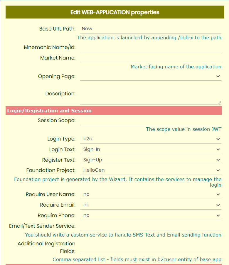
Spend some time closely examining the WEB-APPLICATION properties screenshot below. You will define the application-level behavior and controls here. This also gives you an idea of the amount of work automatically handles for you.
 |
 |
| WEB-APPLICATION properties . | |
Notes:
- Your app will have a URL even though it may be a mobile app.
- This URL serves as the gateway to serve other APIs used in the application or data management.
- Having a single URL for the entire application helps in hosting the application behind a firewall and the external URL (for web-apps) can be a different convenient name.
- You can configure the details of the sign-in module - this is managed by the system. The associated foundation project contains the server-side database and APIs to support this functionality.
- The web application can be optionally rendered as PWA, which can also be configured.
Image, Data and HTML assets
Add the image assets in your application using APP-ASSETS under APP-COMMONS, and then APP-IMAGE nodes under that. Make sure the images have appropriate size and resolution for the purpose you intend to use them for. Note that the mobile app (flutter) IDE requires certain app icon images to be provided separately for Android and iOS - these are not a part of the image assets here.
Your project may also require static data files - these should be added as APP-DATA nodes under APP-ASSETS. Only JSON formatted data files are supported, make sure the data is valid JSON - use a validation tool if required.
Your front-end apps can use locally served HTML content (rendered as WebView in Mobile app). Create your HTML content under APP-ASSETS as APP-CONTENT node. The APP-CONTENT can be hierarchical allowing entire web applications to served locally from the app. The WebIDE also allows you a short-cut to import the web app from a ZIP file.
Pages and Layout
You add APP-PAGE nodes under the WEB-APPLICATION, for each page in your app. Leave the sign-in and sign-up pages out because the system manages it for you. Include all functional pages, whether launched from the menu nav bars or invoked from app interaction.
Create the layout of each by hierarchically adding APP-VIEW and APP-ELEMENT nodes inside the page. The intermediate views in the page will segment the area into rows, columns or grids and the lowest level views will consist of elements - where you will display the data and accept user inputs. provides a wide selection of element types for different needs.
As you define the page layout, build and then run it on the phone emulator, you may encounter errors from the Flutter layout engine. We have some tips-
- Start with a layout that only focusses on dividing the page into views and content for each view. Do not worry about sizing, alignments and scrolling.
- Gradually use view options like 'padding', 'detailed style', 'scroll', 'expand', 'center' etc. to improve the presentation.
- On a page, use the Scroll option in only one view. The easiest is to use it on the top view only. If you decide to use scroll on an inside view, do not set scrolling for the top view.
- For complex scrolling control, get the page to work correctly first, then you can try adding 'scroll' to multiple views. Revert if something breaks.
- Use of 'expand' option is most likely to throw your layout into errors because there are restrictions on its use by Flutter. When you first build your layout, do not use 'expand' at all.
- Gradually, add 'expand' option to views and revert if something breaks.
- Sometimes, a few trial-and-error cycles are needed in getting the layout right.
- In extreme cases, if you cannot get a layout of your desire, you can resort to native Flutter implementation of the view.
Floating Action Button
The mobile app pages can optionally have a Floating Action button - a button displayed as an overlay on the page. Sometimes, you want to provide quick access to certain function without making the user go to the Navigation Menu. The Floating Action button not only draws user's attention to the existence of the feature but also makes is directly accessible.
Flutter has a large collection of Floating Action controls; some even allow you to create a sub-menu around the button. implementation renders a simple circular button that fires the 'floatingaction' event. You can provide an alternate implementation of the button by overriding the following function in the PAGE-FLUTTER code.
Widget? getFloatingActionButton(String? fabicon, String? fabcolor, String? fabsize)
Your custom implementation can fire other events which you can then handle in your code. The example below uses the Flutter Widget FabCircularMenu to implement a sub-menu around the Floating Action Button.
@override
Widget? getFloatingActionButton(String? fabicon, String? fabcolor, String? fabsize) {
  return FabCircularMenu(
    children: [
      IconButton(icon: Icon(MdiIcons.fromString('keyboard'), size: 32), onPressed: () {
        $.app.fire('floatingaction-1', pagename, '', null);
      }),
      IconButton(icon: Icon(MdiIcons.fromString('contacts-outline'), size: 32), onPressed: () {
        $.app.fire('floatingaction-2', pagename, '', null);
      })
    ],
    fabSize: 48,
    ringColor: Colors.white.withOpacity(0.5),
    ringWidth: 80,
    ringDiameter: 200,
    fabColor: $.app.toColor('#e8dcd4'),
    fabOpenIcon: (fabicon == null)
        ? Icon(Icons.menu)
        : Icon(MdiIcons.fromString(fabicon))
    );
}
Data binding
Your application pages will include data that is supplied from outside - from the server API, for instance. You incorporate this in your pages using Data binding. Server APIs are not the only source of data for your application, it can be canned data provided as a data asset file (JSON) - see APP-DATA, or the app context (in-memory app data).
The page rendering is fundamentally different for HTML (Web) apps and Flutter (Mobile) apps. tries to create a common model for both, but you should be aware of differences because the underlying implementations are very different. In HTML, an element on the page can be directly referenced and changed and the program has full flexibility in doing so.
Flutter, however, only allows views (Widgets) to be updated from their state data. Data binding is used to implement this behavior. For your mobile app, any view that you want to dynamically change at run-time (user interactivity), must be bound to a data element (it can be structure). If the data to be bound does not originate from a server API, it can be bound to a local data source.
Data Source, Root and Binding
Routing data to your app pages is controlled through these properties. Data source and root properties are applicable only for a view and binding applies to both views and elements. The rules are as follows:
- All data sources (API, canned, or app context) used in your app must declare their structure in the project schema.
- When defining the data source for a view, you must identify the node in the schema that contains the definition of the source structure. This is essential, otherwise cannot manage the data inside the page.
- A view can have its own data source, or it can be bound to a sub-structure from its parent.
- Multiple data sources can be a part of the same page.
- Data source or binding is not mandatory for a view. For instance, a view may not require any external data.
- If a view does not explicitly bind itself to a source or parent's data sub-structure, it inherits the same binding as its parent.
- If bound, a view must be bound to an object in the source - it cannot be an elementary data item.
- Elements can have bindings for their value, label, help and herotag properties. Each can be a fixed literal value or a binding to an elementary item in its parent view's binding.
As noted - the app context is a simple hash, mapping names to values (possibly objects). Data source property can reference data from the app context. Please note that you must programmatically populate the app context with correct values before pages containing the referenced data are called.
Data source can take one of the following forms-
- A name in format appcontext:name. The name is looked up in the app context and that value (which should an object) is used as source.
- A name starting with http:, or https:. It is taken to an external API which is called to fetch the source.
- A name starting with /. It is taken to a service API and is called to fetch the source.
- Any other name. It is taken to be the name of a data asset (See APP-DATA) in the project, the contents of which are used as the source.
Additionally, with an API URL, app context substitutions can be used to include parameters to the API using the {{}} notation. E.g. http://host.com/products/{{productid}}, where productid is picked up from the app context and substituted for {{productid}}, before calling the API.
Lists
Frequently, you will require to render lists. A list is a block of data that repeats and is rendered to the user as a view or element that repeats following a layout.
While creating the page/view layout you will specify the topology (layout) for it. For instance, a commonly used layout is the column - this means that all its children will be laid out vertically.
If you bind a view to a data object which is an array (declared with DUPLICATES true), then you must provide another topology (layout) for the array - the Container Layout. For instance, if you choose row as layout and column as the Container Layout, then the child elements of the view will appear in a row and the same row structure will be repeated for all data objects in the array, as a column.
Advanced List features
provides a host of value-added functionality when rendering lists. Typically displaying of lists is usually associated with a search functionality allowing the user to search the list. This feature is available as an advanced List control.
Another feature that is available as a part of advanced control is list editing. Typically, the editing of list is achieved by displaying the list and then taking the user on an edit page to edit individual entries. However, with you have the option of the list being directly editable on the same page - you may find this behavior more user-friendly for your users.
For a list that is mapped to a repeating data element (array), you can searchable, lateedit, and latedelete under Control Options. See APP-VIEW.
Styling the app
uses a function first development approach. This means that when developing the app, you will focus on getting the functionality and page content hierarchy right. Both Flutter and CSS/Bulma provide a comprehensive level of styling control to the developers. does not attempt to abstract every fine detail and nuance, because it would defeat the purpose of abstraction.
The style abstraction is, nevertheless, quite comprehensive and should meet most requirements-
- For elements, there are ten named styles - black, white, dark, light, primary, link, info, success, warning, and danger.
- When defining an element, you can select one of the above. Each of these styles come with basic default colors and fonts, which is used to render the element.
- Some basic styling properties can be overridden in the element definition itself.
- Same applies for the views.
- Under APP-COMMONS -> APP-STYLE, you add APPVIEW-STYLE and APPELEMENT-STYLE Tags, which allow a more detailed configuration of styling parameters for Views and Elements respectively.
- With each Element or View definition, you assign the corresponding Detailed Style, to apply that style to the element or view.
- You can also permanently map all the ten named styles to your custom detailed element styles. Then you do not have to assign your custom style to each element separately.
- At the next level of control, you can provide a custom Flutter implementation of certain methods that control the style. See APP-FLUTTER under reference Guide.
- And finally, this is always there.
App navigation
In app, you can have a default navigation plan for the app and you can optionally override it for each page. The navigation plan consists of buttons that will appear on the navigation bars located at the top and/or bottom of the user screen.
You add "APP-NAVIGATION" tag to your application and on pages where you need a different navigation. Within that you add the list of commands and the location of the command button. The button can be positioned on the navigation bar itself (left or right) or on the dropdown menu that is launched from one of the navigation bars. There is a great deal of flexibility on how you decide to structure the navigation controls. A command can be placed on both the top and bottom bar, if required. The dropdown menus themselves are available on both nav bars.
You can attach one of the following actions with each command in the navigation -
- Transition to another named page.
- Launch the named page as a modal popup with a close button. This can be used to display alerts and information messages.
- Login/Logout function. The label for this button is automatically set based on the current logged in status of the user. The command then allows the user to login or logout.
- Programmed handling. In this case, the system does not take any action and you must handle the event programmatically. See events.
Data routing
manages data inputs from the user and automatically makes it available to the API services that are bound to the views. System also automatically renders the views from the API output based on the data bindings.
- All input fields on a page are captured as a flat set of "Name-Value" tuples.
- These values are passed as standard POST HTTP parameters to the API calls in the page that is invoked from the page.
- This works when the page invocation is automatic (in response to a Submit) or programmatic from custom code provided by you.
Server-driven UI
This is a relatively new trend in mobile app development to deal with the challenges associated with pushing your app to your existing users.
- With every push to the play store, there is a publishing process that can take a few days.
- Even after the app is in the play store, it can take many days - even weeks - before the app is updated for all users. You will have to deal with your users running different versions of your app.
- The problem gets further compounded with bugs in your app. If a buggy update gets into circulation, it could take many days before it can be flushed out via an update. This could even affect your business.
In Server-driven mobile UI, you push the description of the page composition via an API from the server, and the app uses that description to render itself.
Building Server-driven mobile UI is a breeze with . No extra steps are required, you simply flag parts of your application that you want server-driven and manages the rest. Pages, views, assets, and even navigation commands can be flagged for server rendering. There are some rules, though-
- You can flag an entire page as Server-driven. This allows you to add completely new pages to your app on-the-fly. There is a caveat here, though. The page cannot have any Flutter/dart code in it, for instance, to handle custom interactivity. The reason is obvious - the flutter code needs to be compiled into the app and cannot be pushed dynamically.
- If a page was static when it was pushed to the play store, you can still override it by changing to Server-driven.
- In pages that are not Server-driven, you can flag specific views to be Server-driven. The advantage of this is that you can have Flutter/dart code that is pushed along with the page to the app, but the content, layout, rendering can be altered on-the-fly.
- App Assets can also be flagged as Server-driven - such assets are not baked into the app, are fetched by the app dynamically.
- App Navigation commands can also be flagged as Server-driven. You can add additional commands to the navbars and override existing ones using this. Please note that adding a command of type "Programmed" requires a handler to be present in your app.
User interactivity
Besides the App navigation, the users will interact with the app by clicking/tapping on elements on the page. In HTML and JavaScript, event handlers can be attached to elements even after they are created. In Flutter, however, the event handler must be provided at the time of creating the element. provides a common model for Web and Mobile apps for letting users interact with your app. This is done through events. The $.app object, that we have seen before, manages these events.
Event routing
The 'fire' and 'listen' methods are used for this. When you define an element on the page (WebIDE), you also mention the events you are interested in, from that element. Then you can take action when these events occur.
- For elements of type 'button', the event 'pressed' is implied and is same for both web and mobile apps (for consistency) - you do not need to mention it in your list.
- For element of type 'submit', the event 'submit' is fired and handled within the system. The default submit behavior is to validate the form and if there are no validation errors, the control is passed to the next page along with all the form fields.
- If you want a different behavior - such as additional validations - use the type 'button' and listen to the 'pressed' event.
The data that is passed at the time of 'fire' is passed to handler mentioned in the 'listen'. Normally, you will not need to fire the events in your program because the system does it automatically based on the events that you have mentioned in the element definition. The event names are the ones that HTML uses - E.g., click, doubleclick, mousever etc. These names are also the same for both web and mobile for consistency - internal implementation will use the appropriate equivalent.
You may use the 'fire' function if you require custom events. There is no restriction on the names of the events, you can use your own custom event names and trigger/handle them programmatically.
| Function | Web App (JS/jQuery) | Mobile App (Dart/Flutter) | ||
|---|---|---|---|---|
| The global UI object | $.app | $.app | ||
| Listen to an event | $.app.listen(eventname, pagename, elementname, handler) | $.app.listen(eventname, pagename, elementname, handler); | ||
| Trigger (fire) an event | $.app.fire(eventname, pagename, elementname, handler, data) | $.app.fire(eventname, pagename, elementname, handler, data); | ||
| Event processing in front-end. | ||||
Event handling
As already mentioned, you handle events though the listen function of the $.app object. An event is uniquely identified as the combination of event name, the page name, and the element name. It is important to note that only one listener can be attached to an event. If you attempt to attach another listener (I.e. call the listen on the same event), the previous one is removed.
So, where should be listening code be placed? For web apps, there is only one place, which is the PAGE-SCRIPT attached to the page. For web apps, although you can override the view layout with HTML code, no JavaScript can be placed there. You must put all listen commands in the PAGE-SCRIPT, there is one for every page.
For mobile apps, you can override the view layout using Flutter code. Besides overriding the _buildWidget method, you can also add initState method to the widget. You can add other widget lifecycle methods there too. The body of the initState method is the right place to listen to events and handle them.
Conditional Activation
has a unique feature for Mobile apps that can be very convenient in managing user interactivity. Some parts of the mobile app (Views, Elements, Navigation Command, and Floating Action button on pages) can be associated with activation codes. The activation codes are programmatically maintained, and the system will switch on/off rendering of the linked UI element.
Updating the user view
Updating the user view is simple and straight forward in HTML/JavaScript/jQuery. You can reference any element by its Id, Class or Name attribute and modify its content.
For Mobile apps, rebuild method of $.app object is used. You will recall from our earlier discussion that any view that you need to programmatically update must be bound to some data (server API or local data asset). This is because Flutter requires that data to be a part of the Widget state.
Dart is a strongly typed language, although you can use untyped variables and structures. The use of strong typing allows for error detection at the time of compilation and leaves you more confident that the code will not blow up at runtime - though the chances are that it still will, for other reasons. takes advantage of the strong typing feature and generates data classes for you based on the data schema you have provided. When a view is rendered, an object of the mapped data class is passed to it - it is not a generic Dart map, but object of a class.
If you are updating a view, you must update this object before the rebuild, otherwise the view will remain unchanged because the underlying data will remain same. The state data for the Widget corresponding to the view can be updated by providing an object of Dart Map<String,dynamic> type. This object should only contain the changes to the original object, which itself was created from the JSON data from its source.
The last parameter to the fire method is this object. The changes from this object are first applied to the state object and then the rebuild of the view is performed. You should examine the generated data classes to know what fields are present in the object.
An example of the rebuild usage is given below -
$.app.listen('click', 'CALCULATOR', 'CBUTTON', (var w) {
	print('CBUTTON Click');
	Text t=w as Text;
	Calculator calc=$.app.state['calc'] as Calculator;
	String val=t.data ?? '';
	var result=calc.key(val);
	$.app.fire('rebuild', 'CALCULATOR', 'CALCTOP', {'value': result});
});
Manipulating the page view
The views and elements on your app pages get their behavior and looks from the configuration you provide in the WebIDE. Certain default behavior is applied to the input elements.
- When user interacts with these elements, events are dispatched for you to action them in your program.
- When navigating between pages, the values entered by the user on a page is made available to the API services on the next page.
At times you may want to modify the configuration of the input element when handing user interactivity. E.g. you may want to disable input on a field based on some condition or may want to alter the look (display properties like style, size, label etc.) at run time. You may also want to change the data displayed on the page in response of some event.
You will use the rebuild method of the $.app object for this. See the $.app Object reference for details.
Mobile app examples-
// Disable input on Element
$.app.rebuild('page-name', 'element-name', {'inputdisabled': true});

// Set counter (property in the bound object) to 2.
$.app.rebuild('page-name', 'view-name', {'counter': 2});

// Increment counter by 1 - by passing patchdata as a function.
$.app.rebuild('page-name', 'view-name', (viewdata) { viewdata['counter']++; });
Web app example-
// Disable input on Element. element is the DOM node.
$.app.rebuild(element, {'inputdisabled': true});
$.app Object Reference
Web app (JS) WIP
| $.app method | Return Type | Parameters | Description | |
|---|---|---|---|---|
| fire | Fire an event | |||
| getAppContext | ||||
| getData | Fetch the data from an URL | |||
| listen | Register a listener for an event | |||
| loadPage | Transition to the named page | |||
| patchAppContext | Update the app context | |||
| popupPage | Open the named page as a popup (dialog) | |||
| $.app JS reference (INCOMPLETE) | ||||
Mobile app (Flutter)
| $.app method | Return Type | Parameters | Description |
|---|---|---|---|
| fire | void |
String eventtype, String pagename, String target, dynamic data |
Fire an event. Event names are generic, and the apps can use any arbitrary name. System fires some fixed event (E.g. nav, pressed, click, rebuild). Apps can fire system events also. The target of the event is identified by the pagename and the target (View or Element). Finally, with the event arbitrary data can be passed which is delivered to the listen handler. |
| formdata | String? |
String pagename, String target, String value |
Set/Get the values in form data. Form data is data that will be sent to the server when the page is submitted. When an input element on the page is changed, this value is updated immediately. If you are writing a custom component, you should make this call to update the form data when its value changes. target is the name of the element and value is the new value. To query the value, pass null for the value. |
| currentContext | BuildContext? | None. | This is the BuildContext for the currently displayed page made accessible to your programs. This is not a function but a variable, which can be directly accessed like $.app.currentContext. |
| getAppContext | dynamic |
String name |
Get an entry from the app context |
| assetUrl | String |
String assetname |
Returns the URL of an asset (APP-ASSET). In Flutter you must obtain the URL of the asset before you can access it. |
| getData | Future |
String url, Map<String,dynamic>? postdata, Map<String,String>? headers, |
Fetch the data from an URL. postdata and headers are optional and named parameters. The method returns a Future<dynamic> object. When the future completes, it resolves to the data received from the API. |
| getViewData | dynamic |
String viewname, String (Named Parameter) as, |
Get the data using which a view was populated. This will be the content of the object that was bound to the view. as parameter can be object or json. |
| getFieldValue | String? |
String pagename, String target, |
Get the current value, including the changes typed by the user, of an Element on the page. The target must be an Element name |
| getImage | Image (Flutter object) |
String url, double width (Named), double height (Named), BoxFit? fit (Named) |
Create an Image object from a source. If the url starts with 'http', the image is retrieved from the URL; if it starts with 'data:', the image is created from the URL; otherwise it is assumed to be a local asset name and the image is created from the asset. Other optional parameters, if provided, are applied on the image while creating it. |
| jsonParse | Map<String,dynamic> |
String? json |
This method converts a JSON string to Dart Map object. |
| listen | void |
String type, String pagename, String target, void Function(dynamic) handler |
Register a listener for an event. You must specify the event name and identify the sending element/view through the pagename and target (which can be view name or element name). For 'nav' events, the pagename is always blank and the target name is the name of the nav command. The handler receives as parameter an object whose type depends on the event being handled. If the event target is a view, the parameter is of type UIView and if the target is an element, the parameter is of type UIElement. (See Helper classes below). |
|
A simplified call of this method is available at page level (inside PAGE-FLUTTER). You do not need to use the $.app. prefix and the pagename parameter is omitted (Current page is assumed). The call syntax is -
listen(String type, String target, void Function(dynamic) handler);
|
|||
| loadPage | void |
UIPage? currentpage, String pagename, bool replace, Map<String,dynamic>? patchcontext (Named), Map<String,dynamic>? patchformdata (Named) |
Transition to the named page. If 'replace' is true, the loaded page replaces the top of page stack (See Flutter documentation). Otherwise, it is added on top of the page stack. This call requires a handle to current page from where you are making this call. This is available to your programs as 'widget.page'. 'pagename' is the name of the page to load. Last two parameters are optional and named. They respectively contain any changes you want to make to the app context and the formdata being submitted, before loading the page. |
| callPage | Future |
UIPage currentpage, String pagename, Map<String,dynamic>? patchcontext (Named), Map<String,dynamic>? patchformdata (Named) |
It is similar to loadPage, except that you can receive a return value from the page when the page closes. The called page must return the value by calling the flutter pop() method on the Flutter Navigator. Example-
Navigator.of($.app.currentContext!).pop(Value_to_be_returned);
|
| loggedIn | bool |
Returns whether the user is logged in or not. If the user is logged in the user details can be retrieved using the loginInfo method. |
|
| loginInfo | dynamic |
Returns information about the current logged in user. The returned value is a Map object. If the login data is in the process of being fetched from the server, a null object will be returned. To do an explicit wait for the data to arrive, you can use-
await $.app.getUserInfo();
|
|
| patchAppContext | void |
Map<String,dynamic>? patchdata |
Update the app context. App context is a global Hash map, preserved across pages. This allows you to pass information between pages. The data bound to app views can also reference elements from it. Updates are applied while retaining the unchanged entries. |
| setActivation | void |
Map<String,bool>? activationset |
Update the current activation settings. This call replacess existing activation Map with the new one. An activation code can be mapped to a true/false value indicating its activation status. |
| patchActivation | void |
Map<String,bool>? patchset |
Update the current activation settings. This call updates the existing activation Map without disturbing unaffected entries. |
| getActivation | bool |
String? activationcode |
Get the current activation setting for the activation code. |
| popupPage | void |
UIPage? currentpage, String pagename, Map<String,dynamic>? patchcontext, Map<String,dynamic>? patchformdata |
Works like 'loadPage', except the page is opened as a popup. |
| rebuild | void | Rebuild a view or an element with changes. The rebuild method works differently for views and elements, described separately below. |
|
| rebuild (View) | void |
String pagename, String viewname, dynamic patchdata |
For the view, the patchdata contains updates to the data object that is bound with the view. It can be a Function which receives the current bound object as parameter and it returns the updated object. Alternatively, it can be an object containing values to be updated. Only values present in the patchdata are updated, others remain unchanged. Also for the view, the nested views are also automatically updated to reflect the data changes. |
| rebuild (Element) | void |
String pagename, String elementname, dynamic patchdata |
For the element, the patchdata contains updates to the element properties - it cannot be a Function. The properties that can be updated are the following and the new property values are in the same format that you provide in the WebIDE, when configuring the element. See Helper Class UIElement for the list of properties. Example (Page Flutter code)- |
void init() {
  // CBUTTON and CALCVAL are elements.
  $.app.state['calc'] = Calculator();
  $.app.listen('pressed', 'CALCULATOR', 'CBUTTON', (var w) {
    print('CBUTTON Click');
    UIElement t=w as UIElement;
    Calculator calc=$.app.state['calc'] as Calculator;
    String val=t.prop('label') ?? '';
    var result=calc.key(val);
    $.app.rebuild('CALCULATOR', 'CALCVAL', {'value': result});
  });
}
|
|||
| scroll | void |
String pagename, String target, String to |
Scrolls the page to the specified location. pagename should refer to the current page (this.pagename), target should be the view name which should be scrolled and to should be one of 'top' or 'bottom'. |
| showNotification | void |
String type, String title, String message |
Displays a notification to the user. type can be 'info', 'warning', or 'danger'. |
| toColor | Color (Flutter Object) |
String colorname |
Convers a named builtin style or a Hex value (if it starts with #) to a Color that can be used for a flutter parameter requiring color. |
| $.app Flutter reference | |||
Helper Class UIView
UIView is the internal implementation of View. A reference of the object is passed to the handler listening to events on the View. The handler can query the properties of the view using the prop method.
| Method | Return Type | Parameters | Description |
|---|---|---|---|
| prop | dynamic |
String name |
Query a property of the view. The following is the list of properties and their respective data types.
|
Helper Class UIElement
UIElement is the internal implementation of the Element. A reference of the object is passed to the handler listening to events on the Element. The handler can query the properties of the view using the prop method.
| Method | Return Type | Parameters | Description |
|---|---|---|---|
| prop | dynamic |
String name |
Query a property of the view. The following is the list of properties and their respective data types.
|
Helper Class UIData
UIData is the internal implementation of Data structure associated with a View. A reference to the view data can be obtained by querying the data property.
| Method | Return Type | Parameters | Description |
|---|---|---|---|
| resolveValue | dynamic |
String? name |
Query a value from the data. If a name is provided the vaue of the named property in data is returned, and if the name is null, the entire data associated with the view is returned as a dynamic hash. |
Push notifications
apps have pre-configured push messaging capability using Firebase Cloud Messaging (FCM) - the messaging platform from Google. You will need to -
- Create a project on Firebase,
- Add apps to the project (for each mobile app),
- Acquire the keys and configuration files, and
- Finally, add the keys/configuration to your ZOAPIIO project.
- The Server key should be copied to your Web App properties in WebIDE.
- The Configuration files should be added to your Mobile project - the configuration for Cordova and Flutter are different.
Please refer to the documentation on Firebase and Cordova/Flutter configuration for the same.
Once your app is compiled and ready, you can send push notifications to the logged in B2C users, from the Admin console of the Base (foundation) Project. To send push notifications from your application (Server APIs), compose a JSON object with following structure -
	{
		"to": "<the Id of the user from the b2cuser entity in your base project>",
		"notification": {
			"title": "The title of the notification message",
			"body": "The text of the notification message"
		}
	}
Then, serialize it into a string, and send to the provided MQ destination as text. The following Biz rule in your WebIDE will accomplish this-
JmsSend to Destination FCMPUSH-QUEUE /Path/to/MessageNode@_JSON
Launching the Web App
The web app is served from the container. This is the most efficient way to render the web app because the instance also holds all your services and data.
It is easy to launch the web app. Simply right click on the WEB-APPLICATION node in your WebIDE and click on "Launch Application". You can also launch it by directly typing its URL in the browser. The app URL is constructed from your instance URL, the app URL and finally appending '/index' to it.
Native Mobile (Flutter) App
Running and testing your mobile app requires you to setup the Flutter development environment on your machine. Flutter is supported on multiple IDEs - most popular being the Android Studio, and Visual Code. You will need to acquire some basic Flutter knowledge - there are several Internet resources available that will get you started very quickly. Pick an IDE and that you are comfortable with and install the flutter environment. WebIDE will generate the Flutter source code, which you must copy into an empty Flutter project shell.
- Install the Flutter environment and create a new project.
- From the ZOAPIIO WebIDE, under the Tools menu, select the "Generate Flutter Project" command.
- Select the application (WEB-APPLICATION) that you want to generate and pick a server URL. When generating the Flutter app that will run with a different ZOAPIIO server, you should change the server URL - default value points to your development server.
- If all goes well, a ZIP file will be downloaded to your machine. Open it and you will find three folders - assets, images and lib. Copy these folders to your Flutter project folder (use the File Explorer to copy the files).
- Use your IDEs build, test, run and package commands to work with your mobile app.
- Use can use either a Mac or a Windows machine, but to be able to test the iOS build of your app, you are required to have a Mac for your development machine.
- Also, all mobile development environments (even before Flutter) are resource hungry. The same is true of Flutter - you need a development machine of a recent vintage.
- In the Flutter project, there is a special file called 'pubspec.yaml' which controls the project environment and external dependencies.
- Make sure the images and assets folders are exposed as project assets.
- Also add the dependencies. The following is an example, your requirements may differ-
- For Android build of the Flutter project, another file called 'AndriodManifest.xml' comes into the picture.
- Make sure the AndriodManifest.xml file grants access to the app to networking and other services by adding the following.
- iOS build will have a similar environment specific control file.
assets:
- images/
- assets/
dependencies:
	cupertino_icons: ^1.0.3
	event_bus: ^2.0.0
	google_fonts: ^3.0.1

dev_dependencies:
	flutter_test:
		sdk: flutter

	http: ^0.13.3
	flutter_spinkit: ^5.1.0
	event_bus: ^2.0.0
	device_info_plus: ^3.2.3
	shared_preferences: any
	animated_text_kit: ^4.2.1
	geolocator: ^8.0.5
	google_sign_in: ^5.3.2
	flutter_facebook_auth: ^4.3.4
	firebase_core: ^1.17.1
	firebase_messaging: ^11.4.1
	material_design_icons_flutter: ^5.0.6295
	flutter_form_builder: 7.2.1
	expressions: ^0.2.3
	table_sticky_headers: ^2.0.0
	flutter_inappwebview: ^5.4.3+7
	flutter_titled_container: ^1.0.7
	video_player: ^2.4.7
	flick_video_player: ^0.5.0
	visibility_detector: ^0.3.3
	url_launcher: ^6.1.6
<manifest xmlns:android="http://schemas.android.com/apk/res/android"
	package="com.XXXX.YYY">
	<uses-permission android:name="android.permission.INTERNET"/>
	<uses-permission android:name="android.permission.ACCESS_COARSE_LOCATION"/>

	<application...
Cordova Mobile App
Cordova is an open-source cross-platform mobile app development platform. The biggest plus in its favor is that you can take an existing web application and compile it for mobile - both Android and iOS. Only requirement is that your web app must be responsive, so that it renders well on the mobile screen.
Cordova mobile apps are not native apps, however. makes building Flutter apps very easy, but it is still not as direct as using Cordova. Depending upon the complexity of user interaction in your app, your target user profile and your development budget, you can decide your entry to the mobile app market. If you are not sure, we suggest you start with the Cordova app because it is faster to build and progressively advance to the native flutter app. Both are cross-platform.
Running and testing your Cordova mobile app requires you to set up the Cordova development environment on your machine. No IDE is required - it is mostly command line, but you can use an IDE, if you already have one. WebIDE will download the web app source code (HTML/CSS/JS) as bundle, which you must copy into an empty Cordova project shell.
- Install the Cordova environment and create a new project.
- From the ZOAPIIO WebIDE, under the Tools menu, select the "Generate Cordova Project" command.
- Select the application (WEB-APPLICATION) that you want to generate and pick a server URL. When generating the Flutter app that will run with a different ZOAPIIO server, you should change the server URL - default value points to your development server.
- If all goes well, a ZIP file will be downloaded to your machine. Open it and you will find the www folder. Copy the contents of this folder to the www folder of your Cordova app.
- That is all you need, just build your Cordova project and run.
- If you need to change the URL of the server for the app, you will find this in the index.html file, simply change the URL and rebuild. You can have different build for testing and production.
 WEB-APPLICATION
 APP-ASSETS
 APP-ASSET
 APP-COMMONS
 APP-CUSTOM
 APP-COMPONENT
 APP-CONTENT
 APP-DATA
 APP-ELEMENT
 APP-FLUTTER
 APP-IMAGE
 APP-META
 APP-NAVCOMMAND
 APP-NAVIGATION
 APP-PAGE
 APP-SPLASHPAGE
 APP-STYLE
 APP-VIEW
 PAGE-SCRIPT
 PAGE-FLUTTER
 APPC-JAVASCRIPT
 APPC-FLUTTER
 APPELEMENT-STYLE
 APPVIEW-FLUTTER
 APPVIEW-HTML
 APPVIEW-STYLE
 APPVIEW-WEBVIEW